Simple and uniform
visualization.
Create easy-to-interpret reports and dashboards with graphomate extensions.
Benefit now from our expertise also in Power BI and Tableau. The graphomate charts, matrix, bubbles and pictograms cover almost all reporting requirements. Our software enables you to use all supported BI front end tools to display your visualizations in a uniform way across all platforms.


available for:


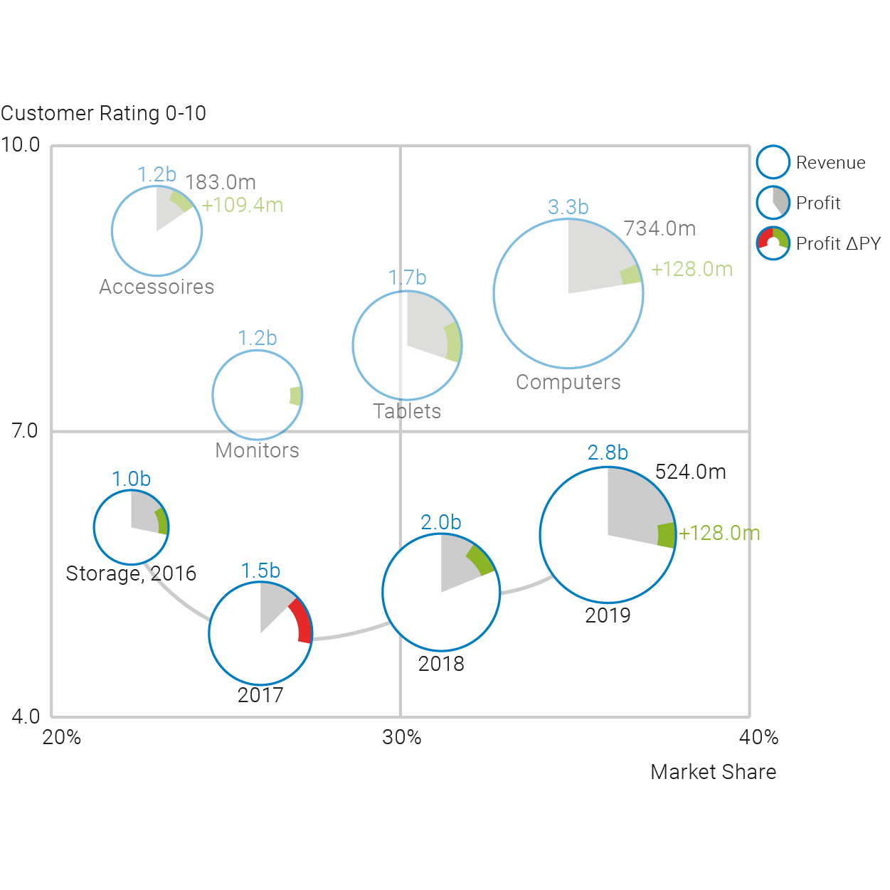
Live Dashboard
Why graphomate?
We have at least four answers for this:

One fits all
graphomate is the only software developer that offers you meaningful visualization components for all “big” BI front ends.
Whether you use Power BI, Tableau or SAP Analytics – SAC, Lumira Designer or Web Intelligence: Our products integrate seamlessly into all tools.
Both the visualization and the user interface are identical and you can even use templates across tools.
Perfect for offering IBCS-compatible templates centrally.

Smooth integration
You can use our graphomate charts, matrix, bubbles and pictograms as well as the standard components of your BI front end.
You can adjust these in many ways via a user interface and connect them with other components of the front end to build interactive dashboards according to your ideas.
Seamless integration for us means that you can place our graphomate components freely on the drawing area as well as apply filters and other actions over all visualization objects – whether they are graphomate or standard visualizations.

Implement IBCS quickly
Over the last 10 years we have learned that the reporting requirements different departments can be very different.
The International Business Communication Standards (IBCS) have proven to be good guidelines, but usually the devil is in the details.
Therefore, we have consciously decided to offer you visualizations that you can flexibly adapt to your ideas, just as you are used to from the standard components of BI tools. However, our setting options go far beyond the standard.

Regular releases
graphomate does not offer pre-configured “visualization off the shelf”. Please feel free to try it out without obligation.


Simply
pleased …
Success stories and reference of our customers
Sie ahnen ja nicht, in wie vielen Berichten ich mich zurechtfinden muss – und alle sind anders. Mit graphomate ist der Wiedererkennungswert hoch und man findet sich zurecht.
Georg Fanta, Leiter des Controllings, Lufthansa Technik
AOK Hessen uses the graphomate extensions in addition to the BO product suite for the preparation of the TOP management reporting. Due to the very user-friendly interface of the extensions, the development time of the reports could be significantly reduced compared to earlier developments without the extensions.
Thomas Lawatsch, Analytical Consultant in the IT-Business Department
Working with the extensions in combination with Lumira 2.1 is a real progress (also compared to the previous solution under Webintelligence)!
Therefore a big compliment to your development. This has made things a lot easier and saved us a lot of work!